
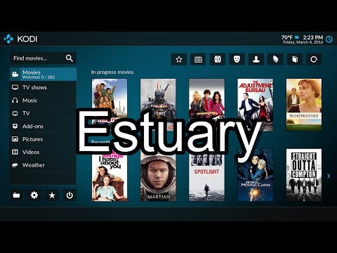
I’ve only known XBMC / Kodi since the open source media center started to show up on ARM based Android and Linux mini PCs around the mid of 2012, and in most devices the default skin called Confluence was used with Kodi/XBMC. It has been used as the default since 2009, and Kodi developers have decided a refresh would be good for Kodi 17 Krypton which will feature two new skins: Estuary for media players and HTPCs, and Estouchy for devices with a touchscreen such as smartphones and tablets.
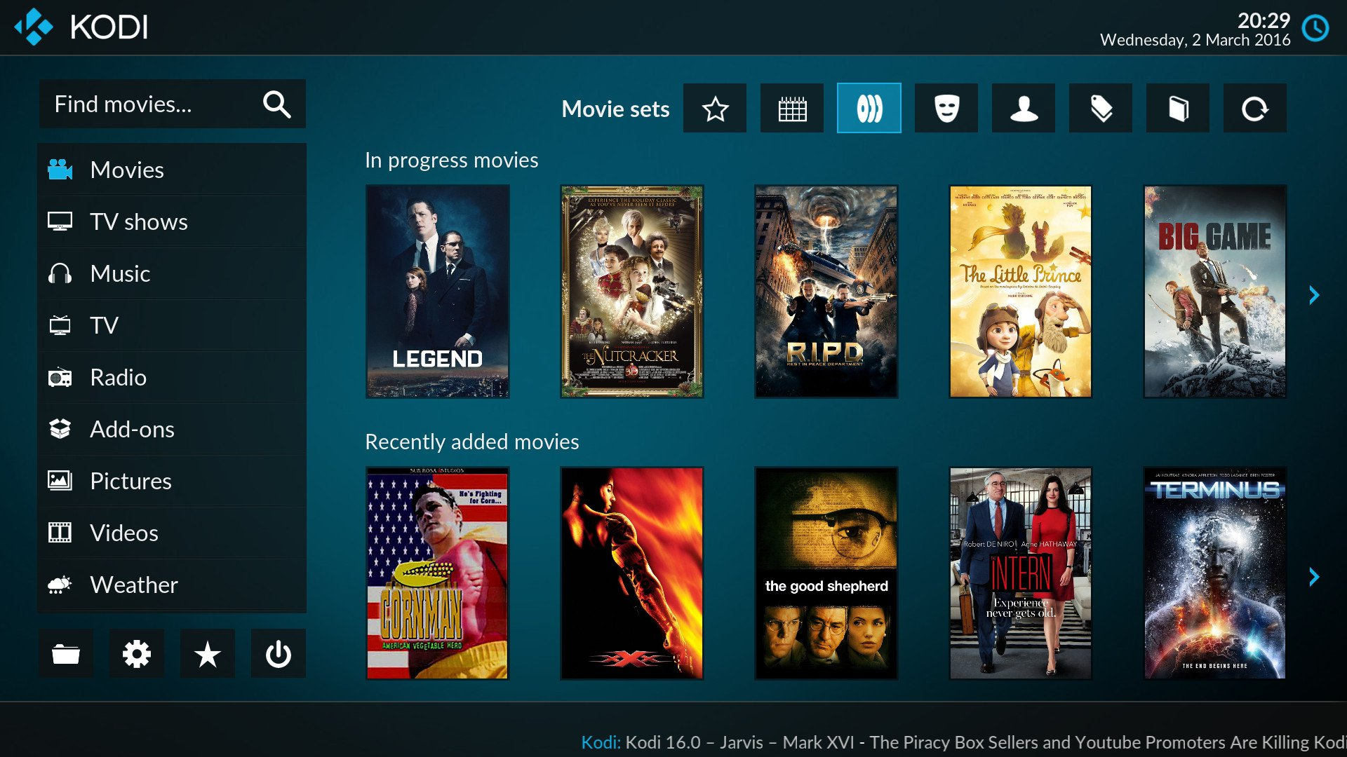
Estuary does away with the horizontal menu found in Confluence, and instead moves the main menu options to the left. Several widgets have also been added for movies and TV including Random, Recently added, In progress and, Random, and similar options are available for Music too.
The media library has also changed the way it displays movies and TV show information, and if the default color is not your preferred choice, you’ll be able to easily change the background color to orange, green, gray, etc… Find out more about Estruary in the trailer video.
Estouchy looks quite similar, but designed for touchscreens, and with a little less features due to the smaller screen size.

Jean-Luc started CNX Software in 2010 as a part-time endeavor, before quitting his job as a software engineering manager, and starting to write daily news, and reviews full time later in 2011.
Support CNX Software! Donate via cryptocurrencies, become a Patron on Patreon, or purchase goods on Amazon or Aliexpress


the on screen keyboard looks nice
The xbmc/kodi devs don’t get it (and probably never will). Its obvious they don’t understand what a fluid user experience is, nor how they can implement it graphically (and not even mention about a “pleasant” UI)
Incoherent behavior, some things via menus, others via dialog boxes, other via endless levels of list after list, others via controls that slide from the side, and not only that but laid out in a way to make it the more annonyingly possible experience for the user
I (seriously) tried several times to like kodi, but there is no way, after all the unstability, archaic codebase, freezes, over bloated, its (complete lack of) ergonomics and its interface from the 2000s, and now the same but implemented in (some half-baked) Flat Design FTW!!!
Hopefully someday they will understand that a Home Theater (read: a TV) is not a place for normal dialogs with caption bars, nor a place for endless levels of menus or behavioral discrepancies on the interaction between the user and its content, in other words a TV is NOT a desktop computer nor a small screen mobile device
Is there a backport of Estuary to Kodi 15?
Check out AeonMQ6. It’s already what Estuary looks like, a bit heavy on resources though.
@LioricZ3
A TV can be both a monitor for a computer and a media device, so I’m afraid that it is you that doesn’t get it.
@LioricZ3
Well you are a troll when post like than instead of a contructive manor, which btw should be done on the Kodi community forum instead of on some blog which is not affiliated with team Kodi.
There are dozens and dozens of skins by other independent skinners for Kodi, so you can change to a different skins if you don’t like the default skins made by Team Kodi members.
Kodi is open source with a very flixible GUI layout engine, so the answer obviously is that you should just create a skin for Kodi on your own and then share it with the world.
well it’s about time they dump confluence
@Harley
i believe that LioricZ3 like many basic users (yeah my turn to troll), cannot stomach having to actually do something to get a “good” experience with their toy.
And i must say, keeping confluence as the default skin for so long has probably been one reason why people would be turned down by Kodi.
But LioricZ3 should also know that you can do much much worse as a media interface and many established industry leaders don’t shy away from doing so !
Esturay is looking nice, but it has problems:
1. The large progress block in “paused view” at the bottom of the page hides subtitles.
2. LazyTV for some reason is incredibly slow under Estuary (works fine after I changed back to confluence)
3. The new “settings” process, with a button that takes you to a menu to access audio or video settings is needlessly long, and also causes the confluence skin to break – so even if it is not removed, it is no longer usable 🙁
4. The flat bright cyan everywhere really hurts my eyes. I wish there was a way to customize that.
All these make it unusable for me, but going back to Confluence means I have to deal with the broken settings options.
@Oded
For point 4., you should be able to change the color, as it’s part of the new options listed in Kodi 17 new UI announcement.
How do you get estuary ?
@James Wilson
Go to the download page @ https://kodi.tv/download/, and get Kodi 17.
That version is in development, so it may not always be stable.